Task 12025/12/06饼状图
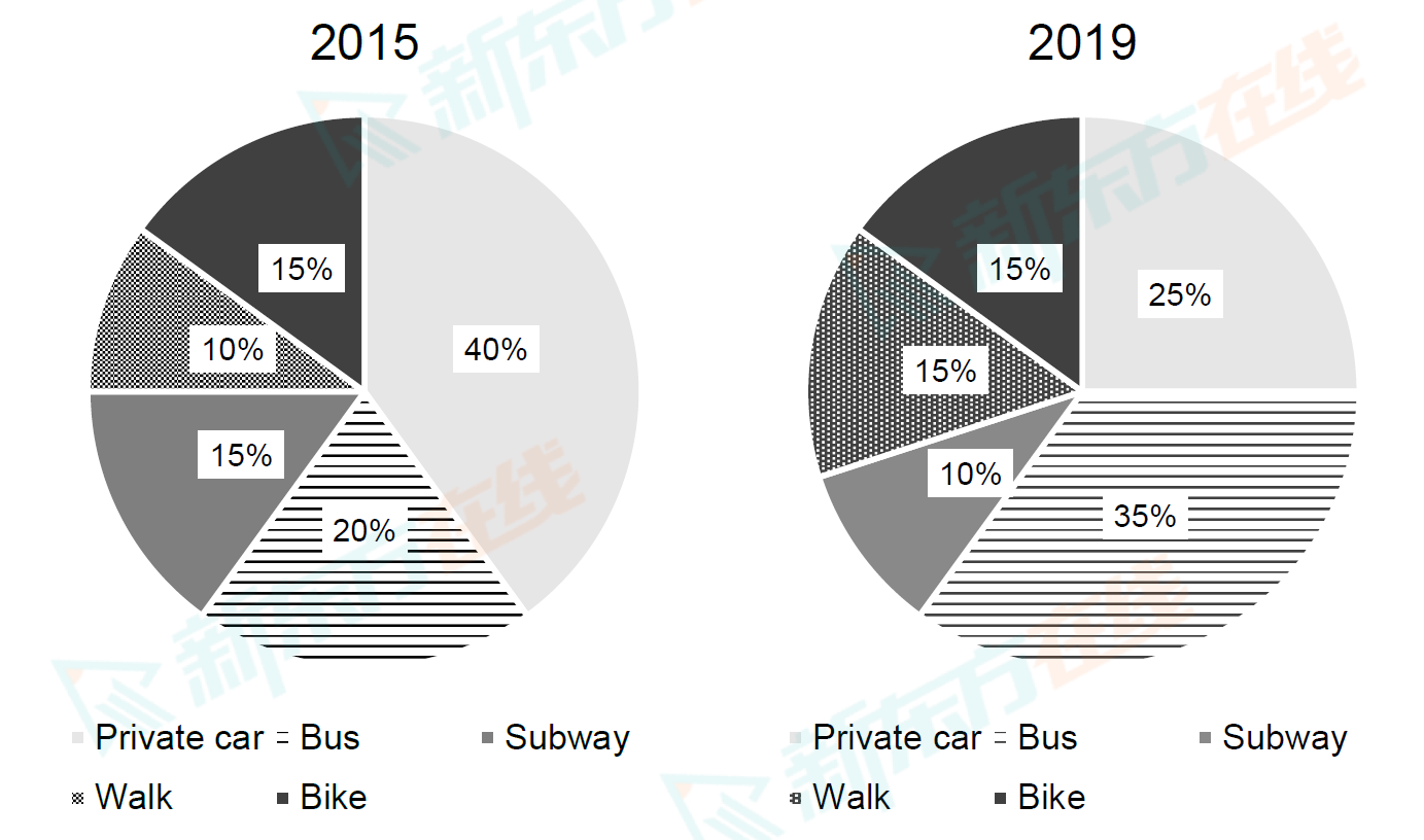
The charts below show the percentage of university students using different modes of transportation to reach campus in the UK in 2015 and 2019.
Summarise the information by selecting and reporting the main features, and make comparisons where relevant.
Write at least 150 words.

Summarise the information by selecting and reporting the main features, and make comparisons where relevant.
Write at least 150 words.


