C9-T2-T1柱状图
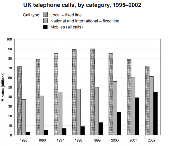
The chart below shows the total number of minutes (in billions) of telephone calls in the UK, divided into three categories, from 1995–2002.
Summarise the information by selecting and reporting the main features, and make comparisons where relevant.
Write at least 150 words.


