Task 12019/09/14柱状图
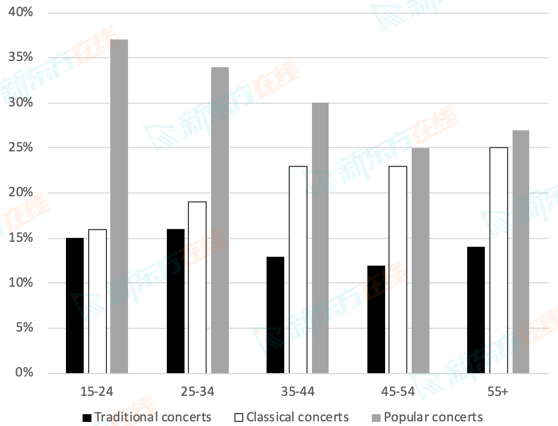
The chart below shows the percentage of people of different age groups attending three types of concerts.
Summarise the information by selecting and reporting the main features, and make comparisons where relevant.
Write at least 150 words.

Summarise the information by selecting and reporting the main features, and make comparisons where relevant.
Write at least 150 words.


