Task 12021/11/27柱状图
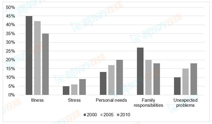
The chart below shows the percentages of staff not going to work for different reasons between 2000 and 2010.
Summarize the information by selecting and reporting the main features, and make comparisons where relevant.
Write at least 150 words.

Summarize the information by selecting and reporting the main features, and make comparisons where relevant.
Write at least 150 words.


