Task 12025/04/26柱状图
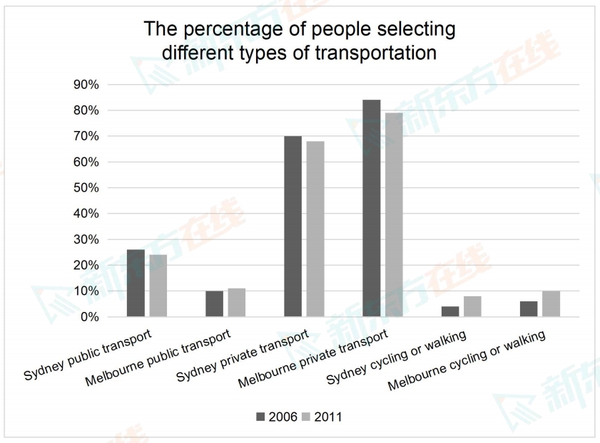
The bar chart below shows the percentages of people choosing different ways to go to work in two cities in 2006 and 2011.
Summarise the information by selecting and reporting the main features, and make comparisons where relevant.
Write at least 150 words.

Summarise the information by selecting and reporting the main features, and make comparisons where relevant.
Write at least 150 words.


