
按照题型针对性练习
题型:
题目
练习记录
练习答题
备考工具
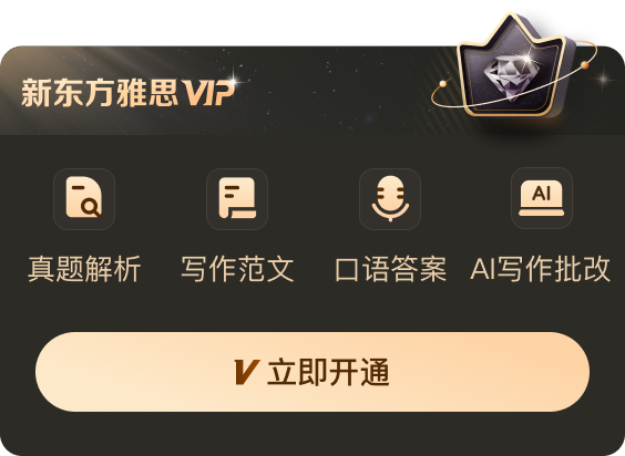
新东方雅思Pro
新东方托福Pro
©本网站所含的雅思真题由剑桥大学出版社与考试委员会独家授权使用


备考工具
新东方雅思Pro App
扫码下载雅思ProApp关注我
新东方雅思Pro小程序
扫码体验雅思小程序关注我
京ICP备2024050960号-2 信息网络传播视听许可证:0110531 营业执照 ![]() 京公网安备11010802044296号 ICP许可证编号:京B2-20241156
京公网安备11010802044296号 ICP许可证编号:京B2-20241156
Copyright © 2024-2024 All Rights Reserved